Design

You are currently browsing articles tagged Design.

I remember back in 1999 working in a web shop that was a sibling company with a traditional ad firm, and thinking “do they realize that digital means more than just packaging copy & images for a new medium?”

Then over the years since, I’ve continually been amazed that most advertising & marketing pros still don’t seem to get the difference between “attention” and actual “engagement” — between momentary desire and actual usefulness.

Then I read this quote from a veteran advertising creative officer:

Instead of building digital things that had utility, we approached it from a messaging mind-set and put messaging into the space. It took us a while to realize … the digital space is completely different.

via The Future of Advertising | Page 4 | Fast Company.

I guess better late than never …

I actually love advertising at its best. Products and brands need to be able to tell great stories about themselves, and engage people’s emotions & aspirations. It’s easy to dump on advertising & marketing as out of touch and wrong-headed — but that’s lazy, it seems to me.

I appreciated the point Bill Buxton made in a talk I saw online a while back about how important the advertising for the iPod was … that it wasn’t just an added-on way to talk about the product; it was part of the whole product experience, driving much of how people felt about purchasing, using and especially *wearing* an iPod and its distinctive white earphones.

But this distinction between utility and pure message is an important one to understand, partly so we can understand how blurred the line has become between them. Back when the only way to interact with a brand was either to receive its advertising message passively, or to purchase and touch/experience its product or service — and there was precious little between — the lines were pretty clear between the message-maker and the product-creator.

These days, however, there are so many opportunities for engagement through interaction, conversation, utility and actual *use* between the initial message and the product itself.

Look at automobiles, for example: once upon a time, there were ads about cars, and then there were the actual cars … and that was pretty much it. But now we get a chance to build the car online, read about it, imagine ourselves in it with various options, look for reviews about it, research prices … all of that before we actually touch the car itself. By the time you touch the car, so much physical engagement has happened on your way to the actual object that your experience is largely shaped already — the car is going to feel different to you if that experience was positive rather than if it was negative (assuming a negative experience didn’t dissuade you from going for a test drive at all).

Granted to some degree that’s always been the case. The advertising acts like the label on a bottle of wine — shaping the expectation of the experience inside the bottle, which we know can make a huge difference.  But the utility experience brings a whole new, physical dimension that affects perception even more: the ability to engage the car interactively rather than passively receiving “messaging” alone. Now it’s even harder to answer the question “where does the messaging end and the car begin?”

I liked this bit from Peter Hacker, the Wittgenstein scholar, in a recent interview. He’s talking about how any way of seeing the world can take over and put blinders on you, if you become too enamored of it:

The danger, of course, is that you over do it. You overplay your hand – you make things clearer than they actually are. I constantly try to keep aware of, and beware of, that. I think it’s correct to compare our conceptual scheme to a scaffolding from which we describe things, but by George it’s a pretty messy scaffolding. If it starts looking too tidy and neat that’s a sure sign you’re misdescribing things.

via TPM: The Philosophers’ Magazine | Hacker’s challenge. (emphasis mine)

It strikes me this is true of design as well. There’s no one way to see it, because it’s just as organic and messy as the world in which we do it.

I mean this both in the larger sense of “what is design?” and the smaller sense of “what design is best for this particular situation?”

Over the years, I’ve come to realize that most things are “messy” — and that while any one solution or model might be helpful, I have to ward against letting it take over all my thinking (which is awfully easy to do … it’s pleasant, and much less work, to just dismiss everything that doesn’t fit a given perspective, right?).

The actual subject of the interview is pretty great too … case in point, for me, it warns against buying into the assumptions behind so much recent neuroscience thinking, especially how it’s being translated in the mainstream (though Hacker goes after some hard-core neuroscience as well).

roadsigns

I’ve recently run across some stories involving Pixar, Apple and game design company Blizzard Entertainment that serve as great examples of courageous redirection.

What I mean by that phrase is an instance where a design team or company was courageous enough to change direction even after huge investment of time, money and vision.

Changing direction isn’t inherently beneficial, of course. And sometimes it goes awry. But these instances are pretty inspirational, because they resulted in awesomely successful user-experience products.

Work colleague Anne Gibson recently shared an article at work quoting Steve Jobs talking about Toy Story and the iPhone. While I realize we’re all getting tired of comparing ourselves to Apple and Pixar, it’s still worth a listen:

At Pixar when we were making Toy Story, there came a time when we were forced to admit that the story wasn’t great. It just wasn’t great. We stopped production for five months…. We paid them all to twiddle their thumbs while the team perfected the story into what became Toy Story. And if they hadn’t had the courage to stop, there would have never been a Toy Story the way it is, and there probably would have never been a Pixar.

(Odd how Jobs doesn’t mention John Lasseter, who I suspect was the driving force behind this particular redirection.)

Jobs goes on to explain how they never expected to run into one of those defining moments again, but that instead they tend to run into such a moment on every film at Pixar. They’ve gotten better at it, but “there always seems to come a moment where it’s just not working, and it’s so easy to fool yourself – to convince yourself that it is when you know in your heart that it isn’t.

That’s a weird, sinking feeling, but it’s hard to catch. Any designer (or writer or other craftsperson) has these moments, where you know something is wrong, but even if you can put your finger on what it is, the momentum of the group and the work already done creates a kind of inertia that pushes you into compromise.

Design is always full of compromise, of course. Real life work has constraints. But sometimes there’s a particular decision that feels ultimately defining in some way, and you have to decide if you want to take the road less traveled.

Jobs continues with a similar situation involving the now-iconic iPhone:

We had a different enclosure design for this iPhone until way too close to the introduction to ever change it. And I came in one Monday morning, I said, ‘I just don’t love this. I can’t convince myself to fall in love with this. And this is the most important product we’ve ever done.’ And we pushed the reset button.

Rather than everyone on the team whining and complaining, they volunteered to put in extra time and effort to change the design while still staying on schedule.

Of course, this is Jobs talking — he’s a master promoter. I’m sure it wasn’t as utopian as he makes out. Plus, from everything we hear, he’s not a boss you want to whine or complain to. If a mid-level manager had come in one day saying “I’m not in love with this” I have to wonder how likely this turnaround would’ve been. Still, an impressive moment.

You might think it’s necessary to have a Steve Jobs around in order to achieve such redirection. But, it’s not.

Another of the most successful products on the planet is Blizzard’s World of Warcraft — the massively multiplayer universe with over 10 million subscribers and growing. This brand has an incredibly loyal following, much of that due to the way Blizzard interacts socially with the fans of their games (including the Starcraft and Diablo franchises).

Gaming news site IGN recently ran a thorough history of Warcraft, a franchise that started about fifteen years ago with an innovative real-time-strategy computer game, “Warcraft: Orcs & Humans.”

A few years after that release, Blizzard tried developing an adventure-style game using the Warcraft concept called Warcraft Adventures. From the article:

Originally slated to release in time for the 1997 holidays, Warcraft Adventures ran late, like so many other Blizzard projects. During its development, Lucas released Curse of Monkey Island – considered by many to be the pinnacle of classic 2D adventures – and announced Grim Fandango, their ambitious first step into 3D. Blizzard’s competition had no intention of waiting up. Their confidence waned as the project neared completion …

As E3 approached, they took a hard look at their product, but their confidence had already been shattered. Curse of Monkey Island’s perfectly executed hand-drawn animation trumped Warcraft Adventures before it was even in beta, and Grim Fandango looked to make it downright obsolete. Days before the show, they made the difficult decision to can the project altogether. It wasn’t that they weren’t proud of the game the work they had done, but the moment had simply passed, and their chance to wow their fans had gone. It would have been easier and more profitable to simply finish the game up, but their commitment was just that strong. If they didn’t think it was the best, it wouldn’t see the light of day.

Sounds like a total loss, right?

But here’s what they won: Blizzard is now known for providing only the best experiences. People who know the brand do not hesitate to drop $50-60 for a new title as soon as it’s available, reviews unseen.

In addition, the story and art development for Warcraft Adventures later became raw material for World of Warcraft.

I’m aware of some other stories like this, such as how Flickr came from a redirection away from making a computer game … what are some others?

In an article called “The Neuroscience of Leadership” (free registration required*), from Strategy + Business a few years ago, the writers explain how new understanding about how the brain works helps us see why it’s so hard for us to fully comprehend new ideas. I keep cycling back to this article since I read it just a few months ago, because it helps me put a lot of things that have perpetually bedeviled me in a better perspective.

One particularly salient bit:

Attention continually reshapes the patterns of the brain. Among the implications: People who practice a specialty every day literally think differently, through different sets of connections, than do people who don’t practice the specialty. In business, professionals in different functions — finance, operations, legal, research an development, marketing, design, and human resources — have physiological differences that prevent them from seeing the world the same way.

Note the word “physiological.” We tend to assume that people’s differences of opinion or perspective are more like software — something with a switch that the person could just flip to the other side, if they simply weren’t so stubborn. The problem is, the brain grows hardware based on repeated patterns of experience. So, while stubbornness may be a factor, it’s not so simple as we might hope to get another person to understand a different perspective.

Recently I’ve had a number of conversations with colleagues about why certain industries or professions seem stuck in a particular mode, unable to see the world changing so drastically around them. For example, why don’t most advertising and marketing professionals get that a website isn’t about getting eyeballs, it’s about creating useful, usable, delightful interactive experiences? And even if they nod along with that sentiment in the beginning, they seem clueless once the work starts?

Or why do some or coworkers just not seem to get a point you’re making about a project? Why is it so hard to collaborate on strategy with an engineer or code developer? Why is it so hard for managers to get those they manage to understand the priorities of the organization?

And in these conversations, it’s tempting — and fun! — to somewhat demonize the other crowd, and get pretty negative about our complaints.

While that may feel good (and while my typing this will probably not keep me from sometimes indulging in such a bitch-and-moan session), it doesn’t help us solve the problem. Because what’s at work here is a fundamental difference in how our brains process the world around us. Doing a certain kind of work in a particular culture of others that work creates a particular architecture in our brains, and continually reinforces it. If your brain grows a hammer, everything looks like a nail; if it grows a set of jumper cables, everything looks like a car battery.

Now … add this understanding to the work Jonathan Haidt and others have done showing that we’re already predisposed toward deep assumptions about fundamental morals and values. Suddenly it’s pretty clear why some of our biggest problems in politics, religion, bigotry and the rest are so damned intractable.

But even if we’re not trying to solve world hunger and political turmoil, even if we’re just trying to get a coworker or client to understand a different way of seeing something, it’s evident that bridging the gap in understanding is not just a peripheral challenge for doing great design work — it may be the most important design problem we face.

I don’t have a ready remedy, by the way. But I do know that one way to start building bridges over these chasms of understanding is to look at ourselves, and be brutally honest about our own limitations.

I almost titled this post “Why Some People Just Don’t Get It” — but I realized that sets the wrong tone right away. “Some People” becomes an easy way to turn others into objects of ridicule, which I’ve done myself even on this blog. It’s easy, and it feels good for a while, but it doesn’t help the situation get better.

As a designer, have you imagined what it’s like to see the world from the other person’s experience? Isn’t that what we mean when we say the “experience” part of “user experience design” — that we design based on an understanding of the experience of the other? What if we treated these differences in point of view as design problems? Are we up to the challenge?

Later Edit:

There have been some excellent comments, some of which have helped me see I could’ve been more clear on a couple of points.

I perhaps overstated the “hardware” point above. I neglected to mention the importance of ‘neuroplasticity‘ — and that the very fact we inadvertently carve grooves into the silly-putty of our brains also means we can make new grooves. This is something about the brain that we’ve only come to understand in the last 20-30 years (I grew up learning the brain was frozen at adulthood). The science speaks for itself much better than I can poorly summarize it here.

The concept has become very important to me lately, in my personal life, doing some hard psychological work to undo some of the “wiring” that’s been in my way for too long.

But in our role as designers, we don’t often get to do psychotherapy with clients and coworkers. So we have to design our way to a meeting of minds — and that means 1) fully understanding where the other is coming from, and 2) being sure we challenge our own presuppositions and blind spots. This is always better than just retreating to “those people don’t get it” and checking out on the challenge altogether, which happens a lot.

Thanks for the comments!

* Yet another note: the article is excellent; a shame registration is required, but it only takes a moment, and in this case I think it’s worth the trouble.

UX Insight Elements

Funny how things can pop into your head when you’re not thinking about them. I can’t remember why this occurred to me last week … but it was one of those thoughts I realized I should write down so I could use it later. So I tweeted it. Lots of people kindly “re-tweeted” the thought, which immediately made me self-conscious that it may not explain itself very well. So now I’m blogging about it. Because that’s what we kids do nowadays.

My tweet: User Experience Design is not data-driven, it’s insight-driven. Data is just raw material for insight.

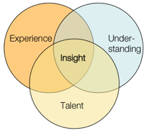
I whipped up a little model to illustrate the larger point: insight comes from a synthesis between talent, expertise, and the fresh understanding we gain through research. It’s a set of ingredients that, when added to our brains and allowed to stew, often over a meal or after a few good nights’ sleep, can bring a designer to those moments of clarity where a direction finally makes sense.

I’ve seen a lot of talk lately about how we shouldn’t be letting data drive our design decisions — that we’re designers, so we should be designing based on best practices, ideas, expertise, and even “taste.” (I have issues with the word “taste” as many people use it, but I don’t have a problem with the idea of “expert intuition” which is I think more what a lot of my colleagues mean. In fact, that Ira Glass video that made the rounds a few weeks ago on many tweets/blogs puts a better spin on the word “taste” as one’s aspiration that may be, for now, beyond one’s actual abilities, without work and practice.)

As for the word “data” — I’m referring to empirical data as well as the recorded results of something less numbers-based, like contextual research. Data is an input to our understanding, but nothing more. Data cannot tell us, directly, how to design anything.

But it’s also ludicrous to ask a client or employer to spend their money based solely on your expertise or … “taste.” Famous interior or clothing designers or architects can perhaps get away with this — because their names carry inherent value, whether their designs are actually useful or not. So far, User Experience design practitioners don’t have this (dubious) luxury. I would argue that we shouldn’t, otherwise we’re not paying much attention to “user experience” to begin with.

Data is valuable, useful, and often essential. Data can be an excellent input for design insight. I’d wager that you should have as much background data as you can get your hands on, unless you have a compelling reason to exclude it. In addition, our clients tend to speak the language of data, so we need to be able to translate our approach into that language.

It’s just that data doesn’t do the job alone. We still need to do the work of interpretation, which requires challenging our presuppositions, blind spots and various biases.

The propensity for the human brain to completely screw stuff up with cognitive bias is, alone, reason enough to put our design ideas through a bit of rigor. Reading through the oft-linked list of cognitive biases on Wikipedia is hopefully enough to caution any of us against the hubris of our own expertise. We need to do the work of seeing the design problem anew, with fresh understanding, putting our assumptions on the table and making sure they’re still viable. To me, at least, that’s a central tenet behind the cultural history of “user experience” design approaches.

But analysis paralysis can also be a serious problem; and data is only as good as its interpretation. Eventually, actual design has to happen. Otherwise you end up with a disjointed palimpsest, a Frankenstein’s Monster of point-of-pain fixes and market-tested features.

We have to be able to do both: use data to inform the fullest possible understanding of the behavior and context of potential users, as well as bring our own experience and talent to the challenge. And that’s hard to do, in the midst of managing client expectations, creating deliverables, and endless meetings and readouts. But who said it was easy?

It appears someone has posted the now-classic episode of Nightline about Ideo (called the Deep Dive) to YouTube. I hope it’s legit and Disney/ABC isn’t going to make somebody take them down. But here’s the link, hoping that doesn’t happen.

About 10 years ago, I started a job as an “Internet Copywriter” at a small web consultancy in North Carolina. By then, I’d already been steeped in the ‘net for seven or eight years, but mainly as a side-interest. My day jobs had been web-involved but not centrally, and my most meaningful learning experiences designing for the web had been side projects for fun. When I started at the new web company job, I knew there would need to be more to my role than just “concepting” and writing copy next to an art director, advertising-style. Our job was to make things people could *use* not just look at or be inspired to action by. But to be frank, I had little background in paid design work.

I’d been designing software of one kind or another off and on for a while, in part-time jobs while in graduate school. For example, creating a client database application to make my life easier in an office manager job (and then having to make it easy enough for the computer-phobic clerical staff to use as well). But I’d approached it as a tinkerer and co-user — making things I myself would be using, and iterating on them over time. (I’d taken a 3-dimensional design class in college, but it was more artistically focused — I had yet to learn much at all about industrial design, and had not yet discovered the nascent IA community, usability crowd, etc.)

Then I happened upon a Nightline broadcast (which, oddly, I never used to watch — who knows why I had it on at this point) where they engaged the design company Ideo. And I was blown away. It made perfect sense… here was a company that had codified an approach to design that I had been groping for intuitively, but not fully grasped and articulated. It put into sharp clarity a number of crucial principles such as behavioral observation and structured creative anarchy.

I immediately asked my new employer to let me order the video and share it with them. It served as a catalyst for finding out more about such approaches to design.

Since then, I’ve of course become less fully enamored of these videos… after a while you start to see the sleight-of-hand that an edited, idealized profile creates, and how it was probably the best PR event Ideo ever had. And ten years gives us the hind-sight to see that Ideo’s supposedly genius shopping cart didn’t exactly catch on — in retrospect we see that it was a fairly flawed design in many ways (in a busy grocery store, how many carts can reasonably be left at the end-caps while shoppers walk about with the hand-baskets?).

But for anyone who isn’t familiar with the essence of what many people I know call “user experience design,” this show is still an excellent teaching tool. You can see people viscerally react to it — sudden realization about how messy design is, by nature, how interdependent it is with physically experiencing your potential users, how the culture needed for creative collaboration has to be cultivated, protected from the Cartesian efficiencies and expectations of the traditional business world, and how important it is to have effective liaisons between those cultures, as well as a wise approach to structuring the necessary turbulence that creative work brings.

Then again, maybe everybody doesn’t see all that … but I’ve seen it happen.

What I find amazing, however, is this: even back then, they were saying this was the most-requested video order from ABC. This movie has been shown countless times in meetings and management retreats. And yet, the basic approach is still so rare to find. The Cartesian efficiencies and expectations form a powerful presence. What it comes down to is this: making room for this kind of work to be done well is hard work itself.

And that’s why Ideo is still in business.

Here’s the presentation I did for A Summit 2009 in Memphis, TN. It’s an update of what I did for IDEA 2008; it’s not hugely different, but I think it pulls the ideas together a little better. The PDF is downloadable from SlideShare. The notes are legible only at full-screen or on the PDF.

There are a lot of cultural swirls in the user-experience design tribe. I’ve delved into some of them now and then with my Communities of Practice writing/presentations. But one point that I haven’t gotten into much is the importance of “taste” in the history of contemporary design.

Several of my twitter acquaintances recently pointed to a post by the excellent Michael Bierut over on Design Observer. It’s a great read — I recommend it for the wisdom about process, creativity and how design actually doesn’t fit the necessary-fiction-prop of process maps. But I’m going to be petty and pick on just one throwaway bit of his essay**

In the part where he gets into the designer’s subconscious, expressing the actual messy stuff happening in a creative professional’s head when working with a client, this bit pops out:

Now, if it’s a good idea, I try to figure out some strategic justification for the solution so I can explain it to you without relying on good taste you may or may not have.

Taste. That’s right — he’s sizing up his audience with regard to “taste.”

Now, you might think I’m going to whine that nobody should be so full of himself as to think of a client this way … that they have “better taste” than someone else. But I won’t. Because I believe some people have a talent for “taste” and some don’t. Some people have a knack, to some degree it’s part of their DNA like having an ear for harmony or incredibly nimble musculature for sports. And to some degree it’s from training — taking that raw talent and immersing it in a culture of other talents and mentors over time.

These people end up with highly sharpened skills and a sort of cultural radar for understanding what will evoke just the right powerful social signals for an audience. They can even push the envelope, introducing expressions that feel alien at first, but feel inevitable only a year later. They’re artists, but their art is in service of commerce and persuasion, social capital, rather than the more rarefied goals of “pure art” (And can we just bracket the “what is art” discussion? That way lies madness).

So, I am in no way denigrating the importance of the sort of designer for whom “taste” is a big deal. They bring powerful, useful skills to the marketplace, whether used for good or ill. “Taste” is at the heart of the “Desirable” leg in the three-leg stool of “Useful, Usable and Desirable.” It’s what makes cultural artifacts about more than mere, brute utility. Clothes, cars, houses, devices, advertisements — all of these things have much of their cultural power thanks to someone’s understanding of what forms and messages are most effective and aspirational for the intended audience. It’s why Apple became a cultural force — because it became more like Jobs than Woz. Taste is OK by me.

However, I do think that it’s a key ingredient in an unfortunate divide between a lot of people in the User Experience community. What do I mean by this?

The word “design” — and the very cultural idea of “designer” — is very bound up in the belief in a special Priesthood of Taste. And many designers who were educated among or in the orbit of this priesthood tend to take their association pretty seriously. Their very identities and personalities, their self-image, depends in part on this association.

Again, I have no problem with that — all of us have such things that we depend on to form how we present ourselves to the world, and how we think of ourselves. As someone who has jumped from one professional sub-culture to another a few times in my careers (ministry, academia, poetry, technologist, user-experience designer) I’ve seen that it’s inevitable and healthy for people to need, metaphorically speaking, vestments with which to robe themselves to signal not just their expertise but their tribal identities. This is deep human stuff, and it’s part of being people.

What I do have a problem with is that perfectly sane, reasonable people can’t seem to be self-aware enough at times to get the hell over it. There’s a new world, with radically new media at hand. And there are many important design decisions that have nothing at all to do with taste. The invisible parts are essential — the interstitial stuff that nobody ever sees. It’s not even like the clockwork exposed in high-end watches, or the elegantly engineered girder structures exposed in modernist architecture. Some of the most influential and culturally powerful designs of the last few years are websites that completely eschewed or offended “taste” of all sorts (craigslist; google; myspace; etc).

The idea of taste is powerful, and perfectly valid, but it’s very much about class-based cultural pecking orders. It’s fun to engage in, but we shouldn’t take it too seriously, or we end up blinded by our bigotry. Designing for taste is about understanding those pecking orders well enough to play them, manipulate them. But taking them too seriously means you’ve gone native and lost perspective.

What I would hope is that, at least among people who collaborate to create products for “user experiences” we could all be a little more self aware about this issue, and not look down our noses at someone who doesn’t seem to have the right “designer breeding.” We live in an age where genius work can come from anywhere and anyone, because the materials and possibilities are so explosively new.

So can we please stop taking the words “design” and “designer” hostage? Can we at least admit that “taste” is a specialized design problem, but is not an essential element of all design? And the converse is necessary as well: can UX folks who normally eschew all aesthetics admit the power of stylistic choice in design, and understand it has a place at the table too? At some point, it would be great for people to get over these silly orthodoxies and prejudices, because there is so much stuff that still needs to be designed well. Let’s get over ourselves, and just focus on making shit that works.

Does it function? Does it work well for the people who use it? Is it an elegant solution, in the mathematical sense of elegance? Does it fit the contours of human engagement and use?

“Taste” will always be with us. There will always be a pecking order of those who have the knack or the background and those who don’t. I’d just like to see more of us understand and admit that it’s only one (sometimes optional) factor in what makes a great design or designer.

**Disclaimer: don’t get me wrong; this is not a rant against Michael Bierut; his comment just reminded me that I’ve run across this thought among a *lot* of designers from the (for lack of better label) AIGA / Comm Arts cultural strand. I think sizing up someone’s “taste” is a perfectly valid concept in its place.

If you’ve ever seen Stanley Kubrick’s movie “Paths of Glory,” it’s a brutal illustration of the distinction between “ideas” and “ideology.”

Kirk Douglas at the "Strategy Table"Kirk Douglas’s character (Colonel Dax) is coming to the “strategy table” after leading his men in the first-hand experience of the trenches. Based on his observations from open-minded, first-hand experience of his troops on the ground, he has ideas about what should and shouldn’t be done strategically. But the strategists, basing their decisions on ideology, force him to lead his soldiers to make a completely suicidal attack: an attack that makes no sense based on what one can plainly see “on the ground.” In this movie, the Strategy Table is ideologically driven; Dax is driven by ideas shaped, and changed, by first-hand experience.

In my last post, Austin Govella commented with some terrific questions that made me think a lot harder about what I was getting at. Austin asked: “Is ‘design doing’ the practice of all design practitioners? Can you be a design practitioner whose practice consists of ideology and abstractions?” And it made me realize I hadn’t fully thought through the distinction. But it’s a powerful distinction to make.

In design practice, ideas are the imaginative constructs we generate as we try to solve concrete problems. Ideas are fluid, malleable, and affected by dialectic. They’re raw material for making into newer, better ideas.

Ideology is nearly the opposite. Ideology already has the questions answered. Ideology is orthodoxy, dogma, received doctrine. It comes from “the gods” — and it’s generally a cop-out. We see it in business all the time, where people make decisions based on assumed doctrine, partly because doing so means that if something goes wrong, you can always say “but that’s what the doctrine said I should do.” It kills innovation, because it plays to our fears of risking failure. And it plays to our tendency to believe in hierarchies, and that the top dog knows what’s best just because he’s the top dog.

Let me be clear: I don’t want to paint designers as saints and business leaders as soulless ideologues. That would, ironically, be making the mistake I’m saying we have to avoid! We are all human, and we’ve all made decisions based on dogma and personal ambition at some point. So, we have to be careful of seeing ourselves as the “in the trenches hero” fighting “the man.” There are plenty of business leaders who strive to shake their ideologies, and plenty of designers who ignore what’s in front of them to charge ahead based on ideology and pure stubbornness.

I also realize that ideology and ideas overlap a good deal — that strategy isn’t always based in dogma, and ideas aren’t always grounded in immediate experience. So, when I say “Strategy Table” I only mean that there’s a strong tendency for people to think as ideologues at that level — it’s a cultural issue. But designers are far from immune to ideology. Very far.

In fact, designers have a track record of inventing ideologies and designing from them. But nearly every example of a terribly designed product can be traced to some ideology. Stewart Brand nicely eviscerates design ideology in “How Buildings Learn” — famous architecture based on aesthetic ideologies, but divorced from the grounded experience of the buildings’ inhabitants, results in edifices that people hate to use, living rooms where you can’t relax, atriums everyone avoids. Falling Water is beautiful, and helped architecture re-think a lot of assumptions about how buildings co-exist with landscapes. But Wright’s own assumptions undermined the building’s full potential: for example, it leaks like a sieve (falling water, indeed). Ideology is the enemy of successful design.

Paradoxically, the only thing close to an ideology that really helps design be better is one that forces us to question our ideological assumptions. But that’s not ideology, it’s method, which is more practical. Methods are ways to trick ourselves into getting to better answers than our assumptions would’ve led us to create. (Note, I’m not saying “methodology” — as soon as you put “ology” on something, you’re carving it in marble.)

Jared Spool’s keynote at the IA Summit this year made this very point: ideology leads to things like a TSA employee insisting that you put a single 3oz bottle of shampoo in a plastic bag, because that’s the rule, even though it makes no practical sense.

But the methods and techniques we use when we design for users should never rise to that level of rules & orthodoxy. They’re tools we use when we need them. They’re techniques & tricks we use to shake ourselves out of our assumptions, and see the design problem at hand more objectively. They live at the level of “patterns” rather than “standards.” As Jared illustrated with his stone soup analogy: putting the stone in the soup doesn’t make the soup — it’s a trick to get people to re-frame what they’re doing and get the soup made with real ingredients.

That distinction is at the heart of this “design thinking” stuff people are talking about. But design thinking can’t be codified and made into dogma — then it’s not design thinking anymore. It has to be grounded in *doing* design, which is itself grounded in the messy, trench-level experience of those who use the stuff we make.

Coming to the “Strategy Table,” a big part of our job is to re-frame the problem for the Lords of the Table, and provoke them to see it from a different point of view. And that is a major challenge.

In Paths of Glory, one of the members of the Strategy Table, Paul Mireau, actually comes to the trenches himself. One of the real dramatic tensions of the film is this moment when we can see the situation through Dax’s eyes, but we can tell from Mireau’s whole bearing that he simply does not see the same thing we do. He’s wearing Strategy Goggles (with personal-ambition-tinted lenses!), and ignores what’s in front of his face.

At the “Strategy Table” one of our biggest challenges is somehow getting underneath the assumptions of the strategy-minded, and help them re-think their strategy based on ideas grounded in the real, messy experience of our users. If we try to be strategists who think and work exclusively at a strategic level, we stop being practitioners with our hands in the soil of our work.

But what if we approach this challenge as a design problem? Then we can see the people at the strategy table as “users,” and our message to them as our design. We can observe them, understand their behaviors and mental models, and design a way of collaborating with them that meets their expectations but undoes their assumptions. At the same time, it will help us understand them as well as we try to understand our users, which will allow us to communicate and collaborate better at the table.

Catching up on the AP blog, I saw Kate Rutter’s excellent post: Build your very own seat at the strategy table, complete with a papercraft “table” with helpful reminders! It’s about designers gaining a place at the “strategy table” — where the people who run things tend to dwell.

I had written something about this a while back, about Strategy & Innovation being “Strange Bedfellows.” But Kate’s post brought up something I hadn’t really focused on yet.

So I commented there, and now I’m repeating here: practitioners’ best work is at the level of practice.

They make things, and they make things better, based on the concrete experience of the things themselves. The strategy table, however, has traditionally been populated by those who are pretty far removed from the street-level effects of their decisions, working from the level of ideology. (Not that it’s a bad thing — most ideology is the result of learned wisdom over time, it just gets too calcified and/or used in the wrong context at times.) This is one reason why so many strategists love data rather than first-hand experience: they can (too often) see the data however they need to, based on whatever ideological glasses they’re wearing.

When designers leave the context of hands-on, concrete problem solving and try to mix it up with the abstraction/ideology crowd, they’re no longer in their element. So they have to *bring* their element along with them.

Take that concrete, messy, human design problem, and drop it on the table with a *thud* — just be ready to have some “data” and business speak ready to translate for the audience. And then dive in and get to work on the thing itself, right in front of them. That’s bringing “design thinking” into the strategy room — because “design thinking” is “design doing.”

I just saw that the BBC tv documentary series based on Stuart Brand’s “How Buildings Learn” has been posted on Google Video. Huzzah!

It’s been a while since I read the book, so I watched a bit of the first episode, and it kicked up a thought or two about the language we use for design. Brand makes a sharp distinction between architecture that’s all about making a “statement” — a stylistic gesture — and architecture that serves the needs of a building’s inhabitants. (Arguably a somewhat artificial distinction, but a useful one nonetheless. For the record, Joshua Prince Ramus made a similar distinction at IASummit07.)

The modernist “statements” Brand shows us are certainly experiences — and were designed to be ‘experienced’ in the sense of any hermetic work of ‘difficult’ art. But it’s harder to say they were designed to be inhabited. On the other hand, he’s talking about something more than mere “use” as well. Maybe, for me at least, the word “use” has a temporary or disposable shade of meaning?

It struck me that saying a design is to be “inhabited” makes me think about different values & priorities than if I a design is to be “used” or “experienced.”

I’m not arguing for or against any of these words in general. I just found the thought intriguing… and I wonder just how much difference it makes how we talk about what we’re making, not only to our clients but to one another and ourselves.

Has anyone else found that how you talk about your work affects the work? The way you see it? The way others respond to it?

Dave Weinberger is blogging bits of the valuably fecund “Reboot” conference this week. Included is a nice summary of Jaiku-founder Jyri Engestrom’s talk. In the past, he’s been very influential among social design folk for pushing the idea of “social objects” — a powerful notion that helps clarify why people do what they do socially (usually it’s around some artifact, subject or object).

This time, Jyri pulls the frame out a bit to look at the bigger picture of social patterns and talks about “nodal points” — there’s more explanation on the post, but here’s a taste:

“Social peripheral vision” lets you see what’s next. If you are unaware of other people’s intentions, you can’t make plans. “Imagine a physical world where we have as much peripheral information at our disposal as in WoW.” Not just “boring update feeds.” Innovate, especially on mobiles. We will see this stuff in the next 24 months. Some examples: Maps: Where my friends are. Phonebook: what are people up to. Email: prioritized. Photos: Face recognition.

« Older entries