communities of practice

You are currently browsing articles tagged communities of practice.

In Defense of D

DTDT means lots of things

A long time ago, in certain communities of practice in the “user experience” family of practices, an acronym was coined: “DTDT” aka “Defining the Damned Thing”.

For good or ill, it’s been used for years now like a flag on the play in a football game. A discussion gets underway, whether heated or not, and suddenly someone says “hey can we stop defining the damned thing? I have work to do here, and you’re cluttering my [inbox / Twitter feed / ear drums / whatever …]”

Sometimes it rightly has reset a conversation that has gone well off the rails, and that’s fine. But more often, I’ve seen it used to shut down conversations that are actually very healthy, thriving and … necessary.

Why necessary? Because conversation *about* the practice is a healthy, necessary part of being a practitioner, and being in a community of other practitioners. It’s part of maturing a practice into a discipline, and getting beyond merely doing work, and on to being self-aware about how and why you do it.

It used to be that people weren’t supposed to talk about sex either. That tended to result in lots of unhappy, closeted people in unfulfilling relationships and unfulfilled desires. Eventually we learned that talking about sex made sex better. Any healthy 21st century couple needs to have these conversations — what’s sex for? how do you see sex and how is that different from how I see it? Stuff like that. Why do people tend to avoid it? Because it makes them uncomfortable … but discomfort is no reason to shun a healthy conversation.

The same goes for design or any other practice; more often than not, what people in these conversations are trying to do is develop a shared understanding of their practice, developing their professional identities, and challenging each other to see different points of view — some of which may seem mutually exclusive, but turn out to be mutually beneficial, or even interdependent.

I’ll grant that these discussions often have more noise than signal, but that’s the price you pay to get the signal. I’ll also grant that actually “defining” a practice is largely a red herring — a thriving practice continues to evolve and discover new things about itself. Even if a conversation starts out about clean, clinical definition, it doesn’t take long before lots of other more useful (but muddier, messier) stuff is getting sorted out.

It’s ironic to me that so many people in the “UX family” of practitioner communities utterly lionize “Great Figures” of design who are largely known for what they *wrote* and *said* about design as much as for the things they made, and then turn to their peers and demand they stop talking about what their practice means, and just post more pat advice, templates or tutorials.

A while back I was doing a presentation on what neuroscience is teaching us about being designers — how our heads work when we’re making design decisions, trying to be creative, and the rest. And one of the things I learned was the importance of metacognition — the ability to think about thinking. I know people who refuse to do such a thing — they just want to jump in and ACT. But more often than not, they don’t grow, they don’t learn. They just keep doing what they’re used to, usually to the detriment of themselves and the people around them. Do you want to be one of those people? Probably not.

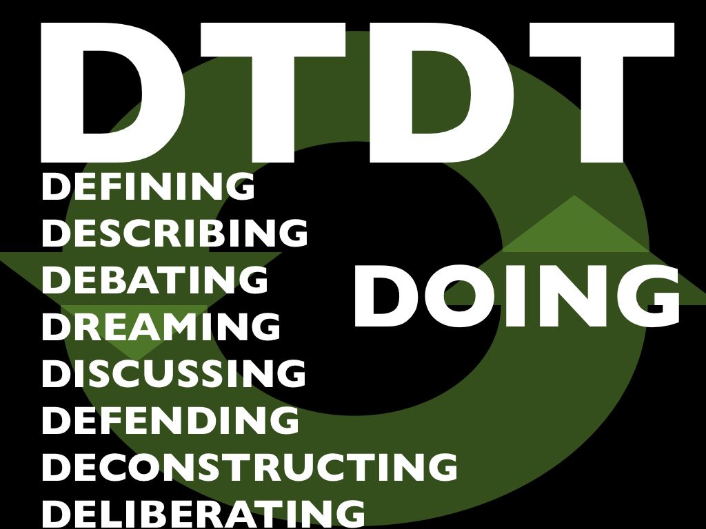
So, enough already. It’s time we defend the D. Next time you hear someone pipe up and say “hey [eyeroll] can we stop the DTDT already?” kindly remind them that mature communities of practice discuss, dream, debate, deliberate, deconstruct and the rest … because ultimately it helps us get better, deeper and stronger at the Doing.

The UX Tribe

UX Meta-community of practiceI don’t have much to say about this, I just want to see if I can inject a meme in the bloodstream, so to speak.

Just an expanded thought I had recently about the nature of all the design practices in the User Experience space. From the tweets and posts and other chatter that drifted my way from the IxDA conference in Vancouver last week, I heard a few comments around whether or not Interaction Designers and Information Architects are the same, or different, or what. Not to mention Usability professionals, Researchers, Engineers, Interface Programmers, or whatever other labels are involved in the sort of work all these people do.

Here’s what I think is happening. I believe we’re all part of the same tribe, living in the same village — but we happen to gather and tell our stories around different camp-fires.

And I think that is OK. As long as we don’t mistake the campfires for separate tribes and villages.

The User Experience (UX) space is big enough, complex enough and evolving quickly enough that there are many folds, areas of focus, and centers of gravity for people’s talents and interests. We are all still sorting these things out — and will continue to do so.

Find me a single profession, no matter how old, that doesn’t have these same variations, tensions and spectrums of interest or philosophical approach. If it’s a living, thriving profession, it’ll have all these things. It’s just that some have been around long enough to have a reified image of stasis.

We need different campfires, different stories and circles of lore. It’s good and healthy. But this is a fairly recently converged family of practices that needs to understand what unifies us first, so that our conversations about what separates us can be more constructive.

The IAI is one campfire. IxDA is another. CHI yet another, and so-on. Over time, some of these may burn down to mere embers and others will turn into bonfires. That’s OK too. As long as, when it comes time to hunt antelope, we all eat the BBQ together.

And now I’m hungry for BBQ. So I’ll leave it at that.

PS: a couple of presentations where I’ve gone into some of these issues, if you haven’t seen them before: UX As Communities of Practice; Linkosophy.

There are a lot of cultural swirls in the user-experience design tribe. I’ve delved into some of them now and then with my Communities of Practice writing/presentations. But one point that I haven’t gotten into much is the importance of “taste” in the history of contemporary design.

Several of my twitter acquaintances recently pointed to a post by the excellent Michael Bierut over on Design Observer. It’s a great read — I recommend it for the wisdom about process, creativity and how design actually doesn’t fit the necessary-fiction-prop of process maps. But I’m going to be petty and pick on just one throwaway bit of his essay**

In the part where he gets into the designer’s subconscious, expressing the actual messy stuff happening in a creative professional’s head when working with a client, this bit pops out:

Now, if it’s a good idea, I try to figure out some strategic justification for the solution so I can explain it to you without relying on good taste you may or may not have.

Taste. That’s right — he’s sizing up his audience with regard to “taste.”

Now, you might think I’m going to whine that nobody should be so full of himself as to think of a client this way … that they have “better taste” than someone else. But I won’t. Because I believe some people have a talent for “taste” and some don’t. Some people have a knack, to some degree it’s part of their DNA like having an ear for harmony or incredibly nimble musculature for sports. And to some degree it’s from training — taking that raw talent and immersing it in a culture of other talents and mentors over time.

These people end up with highly sharpened skills and a sort of cultural radar for understanding what will evoke just the right powerful social signals for an audience. They can even push the envelope, introducing expressions that feel alien at first, but feel inevitable only a year later. They’re artists, but their art is in service of commerce and persuasion, social capital, rather than the more rarefied goals of “pure art” (And can we just bracket the “what is art” discussion? That way lies madness).

So, I am in no way denigrating the importance of the sort of designer for whom “taste” is a big deal. They bring powerful, useful skills to the marketplace, whether used for good or ill. “Taste” is at the heart of the “Desirable” leg in the three-leg stool of “Useful, Usable and Desirable.” It’s what makes cultural artifacts about more than mere, brute utility. Clothes, cars, houses, devices, advertisements — all of these things have much of their cultural power thanks to someone’s understanding of what forms and messages are most effective and aspirational for the intended audience. It’s why Apple became a cultural force — because it became more like Jobs than Woz. Taste is OK by me.

However, I do think that it’s a key ingredient in an unfortunate divide between a lot of people in the User Experience community. What do I mean by this?

The word “design” — and the very cultural idea of “designer” — is very bound up in the belief in a special Priesthood of Taste. And many designers who were educated among or in the orbit of this priesthood tend to take their association pretty seriously. Their very identities and personalities, their self-image, depends in part on this association.

Again, I have no problem with that — all of us have such things that we depend on to form how we present ourselves to the world, and how we think of ourselves. As someone who has jumped from one professional sub-culture to another a few times in my careers (ministry, academia, poetry, technologist, user-experience designer) I’ve seen that it’s inevitable and healthy for people to need, metaphorically speaking, vestments with which to robe themselves to signal not just their expertise but their tribal identities. This is deep human stuff, and it’s part of being people.

What I do have a problem with is that perfectly sane, reasonable people can’t seem to be self-aware enough at times to get the hell over it. There’s a new world, with radically new media at hand. And there are many important design decisions that have nothing at all to do with taste. The invisible parts are essential — the interstitial stuff that nobody ever sees. It’s not even like the clockwork exposed in high-end watches, or the elegantly engineered girder structures exposed in modernist architecture. Some of the most influential and culturally powerful designs of the last few years are websites that completely eschewed or offended “taste” of all sorts (craigslist; google; myspace; etc).

The idea of taste is powerful, and perfectly valid, but it’s very much about class-based cultural pecking orders. It’s fun to engage in, but we shouldn’t take it too seriously, or we end up blinded by our bigotry. Designing for taste is about understanding those pecking orders well enough to play them, manipulate them. But taking them too seriously means you’ve gone native and lost perspective.

What I would hope is that, at least among people who collaborate to create products for “user experiences” we could all be a little more self aware about this issue, and not look down our noses at someone who doesn’t seem to have the right “designer breeding.” We live in an age where genius work can come from anywhere and anyone, because the materials and possibilities are so explosively new.

So can we please stop taking the words “design” and “designer” hostage? Can we at least admit that “taste” is a specialized design problem, but is not an essential element of all design? And the converse is necessary as well: can UX folks who normally eschew all aesthetics admit the power of stylistic choice in design, and understand it has a place at the table too? At some point, it would be great for people to get over these silly orthodoxies and prejudices, because there is so much stuff that still needs to be designed well. Let’s get over ourselves, and just focus on making shit that works.

Does it function? Does it work well for the people who use it? Is it an elegant solution, in the mathematical sense of elegance? Does it fit the contours of human engagement and use?

“Taste” will always be with us. There will always be a pecking order of those who have the knack or the background and those who don’t. I’d just like to see more of us understand and admit that it’s only one (sometimes optional) factor in what makes a great design or designer.

**Disclaimer: don’t get me wrong; this is not a rant against Michael Bierut; his comment just reminded me that I’ve run across this thought among a *lot* of designers from the (for lack of better label) AIGA / Comm Arts cultural strand. I think sizing up someone’s “taste” is a perfectly valid concept in its place.

This is based on a slide I’ve been slipping into decks for over a year now as a “quick aside” comment; but it’s been bugging me enough that I need to get it out into a real blog post. So here goes.

We hear the words Strategy and Innovation thrown around a lot, and often we hear them said together. “We need an innovation strategy.” Or perhaps “We need a more innovative strategy” which, of course, is a different animal. But I don’t hear people questioning much exactly what we mean when we say these things. It’s as if we all agree already on what we mean by strategy and innovation, and that they just fit together automatically.

There’s a problem with this assumption. The more I’ve learned about Communities of Practice, the more I’ve come to understand about how innovation happens. And I’ve come to the conclusion that strategy and innovation aren’t made of the same cloth.
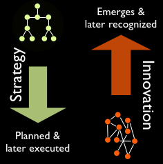
strategy and innovation

1. Strategy is top-down; Innovation is bottom-up

Strategy is a top-down approach. In every context I can think of, strategy is about someone at the top of a hierarchy planning what will happen, or what patterns will be invoked to respond to changes on the ground. Strategy is programmed, the way a computer is programmed. Strategy is authoritative and standardized.

Innovation is an emergent event; it happens when practitioners “on the ground” have worked on something enough to discover a new approach in the messy variety of practitioner effort and conversation. Innovation only happens when there is sufficient variety of thought and action; it works more like natural selection, which requires lots of mutation. Innovation is, by its nature, unorthodox.

2. Strategy is defined in advance; Innovation is recognized after the fact

While a strategy is defined ahead of time, nobody can seem to plan what an innovation will be. In fact, many (or most?) innovations are serendipitous accidents, or emerge from a side-project that wasn’t part of the top-down-defined work load to begin with. This is because the string of events that led to the innovation is never truly a rational, logical or linear process. In fact, we don’t even recognize the result as an innovation until after it’s already happened, because whether something is an innovation or not depends on its usefulness after it’s been experienced in context.

We fill in the narrative afterwards — looking back on what happened, we create a story that explains it for us, because our brains need patterns and stories to make sense of things. We “reify” the outcome and assume there’s a process behind it that can be repeated. (Just think of Hollywood, and how it tries to reproduce the success of surprise-hit films that nobody thought would succeed until they became successful.) I discuss this more in a post here.

3. Strategy plans for success in known circumstances; Innovation emerges from failure in unknown circumstances.

One explicit aim of a strategy is to plan ahead of time to limit the chance of failure. Strategy is great for things that have to be carried out with great precision according to known circumstances, or at least predicted circumstances. Of course strategy is more complex than just paint-by-numbers, but a full-fledged strategy has to have all predictable circumstances accounted for with the equivalent of if-then-else statements. Otherwise, it would be a half-baked strategy. In addition, strategy usually aims for the highest level of efficiency, because carrying something off with the least amount of friction and “wasted” energy often makes the difference between winning and losing.

However, if you dig underneath the veneer of the story behind most innovations, you find that there was trial and error going on behind the scenes, and lots of variety happening before the (often accidental) eureka moment. And even after that eureka moment, the only reason we think of the outcome as an innovation is because it found traction and really worked. For every product or idea that worked, there were many that didn’t. Innovation sprouts from the messy, trial-and-error efforts of practitioners in the trenches. Bell Labs, Xerox PARC and other legendary fonts of innovation were crucibles of this dynamic: whether by design or accident, they had the right conditions for letting their people try and fail often enough and quickly enough to stumble upon the great stuff. And there are few things less efficient than trial and error; innovation, or the activity that results in innovation, is inherently inefficient.

So Innovation and Strategy are incompatible?

Does this mean that all managers can do is cross their fingers and hope innovation happens? No. What it does mean is that to having an innovation strategy has nothing to do with planning or strategizing the innovation itself. To misappropriate a quotation from Ecclesiastes, such efforts are all in vain and like “striving after wind.”

Managing for innovation requires a more oblique approach, one which works more directly on creating the right conditions for innovation to occur. And that means setting up mechanisms where practitioners can thrive as a community of practice, and where they can try and fail often enough and quickly enough that great stuff emerges. It also means setting up mechanisms that allow the right people to recognize which outcomes have the best chance of being successes — and therefore, end up being truly innovative.

I’m as tired of hearing about Apple as anyone, but when discussing innovation they always come up. We tend to think of Apple as linear, controlled and very top-down. The popular imagination seems to buy into a mythic understanding of Apple — that Steve Jobs has some kind of preternatural design compass embedded in his brain stem.

Why? Because Jobs treats Apple like theater, and keeps all the messiness behind the curtain. This is one reason why Apple’s legal team is so zealous about tracking down leaks. For people to see the trial and error that happens inside the walls would not only threaten Apple’s intellectual property, it would sully its image. But inside Apple, the strategy for innovation demands that design ideas to be generated in multitudes like fish eggs, because they’re all run through a sort of artificial natural-selection mechanism that kills off the weak and only lets the strongest ideas rise to the top. (See the Business Week article describing Apple’s “10 to 3 to 1” approach. )

Google does the same thing, but they turn the theater part inside-out. They do a modicum of concept-vetting inside the walls, but as soon as possible they push new ideas out into the marketplace (their “Labs” area) and leverage the collective interest and energy of their user base to determine if the idea will work or not, or how it should be refined. (See accounts of this philosophy in a recent Fast Company article.) People don’t mind using something at Google that seems to be only half-successful as a design, because they know it’ll be tweaked and matured quickly. Part of the payoff of using a Google product is the fun of seeing it improved under your very fingertips.

One thing I wonder: to what extent do any of these places treat “strategy” as another design problem to be worked out in the bottom-up, emergent way that they generate their products? I haven’t run across anything that describes such an approach.

At any rate, it’s possible to have an innovation strategy. It’s just that the innovation and the strategy work from different corners of the room. Strategy sets the right conditions, oversees and cultivates the organic mass of activity happening on the floor. It enables, facilitates, and strives to recognize which ideas might fit the market best — or strives to find low-impact ways for ideas to fail in the marketplace in order to winnow down to the ones that succeed. And it’s those ideas that we look back upon and think … wow, that’s innovation.
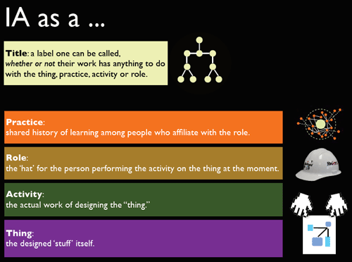
In the closing talk for this year’s IA Summit, I had a slide that explains the various layers that make up what we use the term “Information Architect” (or “Information Architecture”) to denote. I think it’s important to be self-aware about it, because it helps us avoid a lot of wasted breath and miscommunication.

But I also stressed that I don’t think this model is only true of IA. So please, feel free to replace “IA” in the diagram with the name of any practice, profession or domain of work.

To understand this diagram, especially the part about Practice, it helps to have a basic understanding of what “practice” is and how it emerges from a community that coalesces around a shared concern. The Linkosophy deck gets into that, and my UX as Communities of Practice deck does as well, while getting into more detail about the participation/reification dynamic Wenger describes in his work.

Here’s the model: I’ll do a bit of explanation after the jump.

title and role stack (small version)

Read the rest of this entry »

In the “Linkosophy” talk I gave on Monday, I suggested that a helpful distinction between the practices of IxD & IA might be that IxD’s central concern is within a given context (a screen, device, room, etc) while IA’s central concern is how to connect contexts, and even which contexts are necessary to begin with (though that last bit is likely more a research/meta concern that all UX practices deal with).

But one nagging question on a lot of people’s minds seems to be “where did these come from? haven’t we been doing all this already but with older technology?”

I think we have, and we haven’t.

Both of these practices build on earlier knowledge & techniques that emerged from practices that came before. Card sorting & mental models were around before the IA community coalesced around the challenges of infospace, and people were designing devices & industrial products with their users’ interactions in mind long before anybody was in a community that called itself “Interaction Designers.” That is, there were many techniques, methods, tools and principles already in the world from earlier practice … but what happened that sparked the emergence of these newer practice identities?

The key catalyst for both, it seems to me, was the advent of digital simulation.

For IA, the digital simulation is networked “spaces” … infospace that’s made of bits and not atoms, where people cognitively experience one context’s connection to another as moving through space, even though it’s not physical. We had information, and we had physical architecture, but they weren’t the same thing … the Web (and all web-like things) changed that.

For IxD, the digital simulation is with devices. Before digital simulation, devices were just devices — anything from a deck chair to an umbrella, or a power drill to a jackhammer, were three-dimensional, real industrially made products that had real switches, real handles, real feedback. We didn’t think of them as “interactive” or having “interfaces” — because three-dimensional reality is *always* interactive, and it needs no “interface” to translate human action into non-physical effects. Designing these things is “Industrial Design” — and it’s been around for quite a while (though, frankly, only a couple of generations).

The original folks who quite consciously organized around the collective banner of “interaction designer” are digital-technology-centric designers. Not to say that they’ve never worked on anything else … but they’re leaders in that practitioner community.

Now, this is just a comment on origins … I’m not saying they’re necessarily stuck there.

But, with the digital-simulation layer soaking into everything around us, is it really so limiting to say that’s the origin and the primary milieu for these practices?

Of course, I’m not trying to build silos here — only clarify for collective self-awareness purposes. It’s helpful, I believe, to have shared understanding of the stories that make up the “history of learning and making” that forms our practices. It helps us have healthier conversations as we go forward.

Linkosophy

In 2008 I had the distinct honor to present the closing plenary for the IA Summit in Miami, FL. Here’s the talk in its entirety. Unfortunately the podcast version was lost, so there’s no audio version, but 99% of what I had to say is in the notes.

NOTE: To make sense of this, you’ll need to read the notes in full-screen mode. (Or download the 6 MB PDF version.)

(Thanks to David Fiorito for compressing it down from its formerly gigantic size!)

Giving this talk at the IA Summit was humbling and a blast; I’m so grateful for the positive response, and the patience with these still-forming ideas.

If you’re after some resources on Communities of Practice and the like, see the post about the previous year’s presentation which has lots of meaty links and references.

IASummit 2008

Meet me at the IA Summit
Some very nice and well-meaning people have asked me to speak as the closing plenary at the IASummit conference this year, in Miami.

This is, as anyone who has been asked to do such a thing will tell you, a mixed blessing.

But I’m slogging through my insanely huge bucket of random thoughts from the last twelve months to surface the stuff that will, I dearly hope, be of interest and value to the crowd. Or, at the very least, keep their hungover cranial contents entertained long enough to stick around for Five-Minute Madness.

“Linkosophy” is a homely title. But it’s a hell of a lot catchier than “Information Architecture’s Role in the UX Context: What Got It Here, What It’s About, and Where It Might Be Headed.” Or some such claptrap.

Here’s the description and a link:

Closing Plenary: Linkosophy
Monday April 14 2008, 3:00 – 4:00PM

At times, especially in comparison to the industrial and academic disciplines of previous generations, the User Experience family of practices can feel terribly disorganized: so little clarity on roles and responsibilities, so much dithering over semantics and orthodoxy. And in the midst of all this, IA has struggled to explain itself as a practice and a domain of expertise.

But guess what? It turns out all of this is perfectly natural.

To explain why, we’ll use IA as an example to learn about how communities of practice work and why they come to be. Then we’ll dig deeper into describing the “domain” of Information Architecture, and explore the exciting implications for the future of this practice and its role within the bigger picture of User Experience Design.

In addition, I’ve been dragooned (but in a nice way … I just like saying “dragooned”) to participate in a panel about “Presence, identity, and attention in social web architecture” along with Christian Crumlish, Christina Wodtke, and Gene Smith, three people who know a heck of a lot more about this than I do. Normally when people ask me to talk about this topic, I crib stuff from slides those three have already written! Now I have to come up with my own junk. (Leisa Reichelt is another excellent thinker on this “presence” stuff, btw. And since she’s not going to be there, maybe I’ll just crib *her* stuff? heh… just kidding, Leisa. Really.)

Seriously, it should be a fascinating panel — we’ve been discussing it on a mailing list Christian set up, so there should be some sense that we actually prepared for it.