Articles by Andrew

Owner of inkblurt.com

I’m very happy to announce I’m joining The Understanding Group as an Information Architect.

I’m a big believer in TUG’s mission: using information architecture to make things “be good.”

Since I’ve been blathering on and on about the importance of IA for over a decade now, I figured I might as well put my career where my mouth is and join up with this exciting new firm that has IA as its organizing principle. It doesn’t hurt that the people are pretty awesome too.

For the time being I’ll still be living in Atlanta, but traveling on occasion to Michigan, NYC and wherever else necessary to collaborate with clients and team members.

But unfortunately, going on to something new means having to leave behind something else.

I want to say that I’ll miss working with the great people at Macquarium. The two years I’ve spent with “MQ” have been among the best of my career, in terms of the practitioners I’ve gotten to know, the clients I’ve been able to partner with, and the fascinating, challenging work I’ve gotten to do.

Macquarium is doing some of the most cutting-edge work I’ve heard of in the cross-channel, service-design and organizational design spaces. I’m very fortunate to have had the chance to be part of their team.


I’ve been thinking a lot lately about responsiveness in design, and how we can build systems that work well in so many different contexts, on so many different devices, for so many different scenarios. So many of our map-like ways of predicting and designing for complexity are starting to stretch at the seams. I have to think we are soon reaching a point where our maps simply will not scale.

Then there are the secret-sauce, “smart” solutions that promise they can take care of the problem. It seems to happen on at least every other project: one or more stakeholders are convinced that the way to make their site/app/system truly responsive to user needs is to employ some kind of high-tech, cutting-edge technology.

This can take the form of clippy-like “helpers” that magically know what the user needs, to “conversation engines” that try to model a literal conversational interaction with users, like Jellyvision, or established technologies like the “collaborative filtering” technique pioneered by places like Amazon.

Most of the time, these sorts of solutions hold out more promise than they can fulfill. They aren’t bad ideas — even Clippy had merit as a concept. But to my mind, more often than not, these fancy approaches to the problem are a bit like building a 747 to take people across a river — when all that’s needed is a good old-fashioned bridge. That is, most of the time the software in question isn’t doing the basics. Build a bridge first, then let’s talk about the airliner.

Of course, there are genuine design challenges that do seem to still need that super-duper genius-system approach. But I still think there are more “primitive” methods that can do most of the work by combining simple mechanisms and structures that can actually handle a great deal of complexity.

We have a cognitive bias that makes us think that anything that seems to respond to a situation in a “smart” way must be “thinking” its way through the solution. But it turns out, that’s not how nature solves complex problems — it’s not even really how our bodies and brains work.

I think the best kind of responsiveness would follow the model we see in nature — a sort of “embodied” responsiveness.

I’ve been learning a lot about this through research for the book on designing context I’m working on now. There’s a lot to say about this … a lot … but I need to spend my time writing the book rather than a blog post, so I’ll try to explain by pointing to a couple of examples that may help illustrate what I mean.

Consider two robots.

One is Honda’s famous Asimo. It’s a humanoid robot that is intricately programmed to handle situations … for which it is programmed. It senses the world, models the world in its brain and then tells the body what to do. This is, by the way, pretty much how we’ve assumed people get around in the world: the brain models a representation of the world around us and tells our body to do X or Y. What this means in practice, however, is that Asimo has a hard time getting around in the wild. Modeling the world and telling the limbs what to do based on that theoretical model is a lot of brain work, so Asimo has some major limitations in the number of situations it can handle.  In fact, it falls down a lot (as in this video) if the terrain isn’t predictable and regular, or if there’s some tiny error that throws it off. Even when Asimo’s software is capable of handling an irregularity, it often can’t process the anomaly fast enough to make the body react in time. This, in spite of the fact that Asimo has one of the most advanced “brains” ever put into a robot.

Another robot is nicknamed Big Dog, by a company called Boston Dynamics. This robot is not pre-programmed to calculate its every move. Instead, its body is engineered to respond in smart, contextually relevant ways to the terrain. Big Dog’s brain is actually very small and primitive, but the architecture of its body is such that its very structure handles irregularity with ease, as seen in this video where, about 30 seconds in, someone tries to kick it over and it rights itself.

The reason why Big Dog can handle unpredictable situations is that its intelligence is embodied. It isn’t performing computations in a brain — the body is structured in such a way that it “figures out” the situation by the very nature of its joints, angles and articulation. The brain is just along for the ride, and providing a simple network for the body to talk to itself. As it turns out, this is actually much more like how humans get around — our bodies handle a lot more of our ‘smartness’ than we realize.

I won’t go into much more description here. (And if you want to know more, check this excellent blog post on the topic of the robots, which links/leads to more great writing on embodied/extended cognition & related topics.)

The point I’m getting at is that there’s something to be learned here in terms of how we design information environments. Rather than trying to pre-program and map out every possible scenario, we need systems that respond intelligently by the very nature of their architectures.

A long time ago, I did a presentation where I blurted out that eventually we will have to rely on compasses more than maps. I’m now starting to get a better idea of what I meant. Simple rules, simple structures, that combine to be a “nonlinear dynamical system.” The system should perceive the user’s actions and behaviors and, rather than trying to model in some theoretical brain-like way what the user needs, the system’s body (for lack of a better way to put it) should be engineered so that its mechanisms bend, bounce and react in such a way that the user feels as if the system is being pretty smart anyway.

At some point I’d like to have some good examples for this, but the ones I’m working on most diligently at the moment are NDA-bound. When I have time I’ll see if I can “anonymize” some work well enough to share. In the meantime, keep an eye on those robots.


Tonight, I ran across some files from 2002 (10 yrs ago), some of which were documents from the founding of the IA Institute. At some point I need to figure out what to do with all that.

But among these files was a text clipping that looks as if it was probably part of a response I was composing for a mailing list or something. And it struck me that I’ve been obsessing over the same topics for at least 10 years. Which is … comforting… but also disconcerting. I suppose i’m glad I’m finally writing a book on some of these issues because now maybe I can exorcise them and move on.

Here’s the text clipping.

I agree it’s not specific to the medium. If you can call the Internet a medium. I really think it’s about creating spaces from electrons rather than whole atoms.

If putting two bricks together is architecture (Mies), then putting two words together is writing. The point is that you’re doing architecture or writing, but not necessarily well. Both acts have to be done with a rationale, with intention and skill. And their ultimate success as designs depend upon how well they are used and/or understood.

But what about putting two ideas together, when the ideas manifest themselves not as words alone, but as conceptual spaces that are experienced physically, with clicking fingers and darting eyeballs. No walking necessary, just some control that’s quick enough to follow each connecting thought.

What really separates IA from writing? I could say that putting About and Careers together is “writing” … It’s a phrase “about careers.” But if I put About and Careers together in the global navigation of a website, with perhaps a single line between them to separate them, there’s another meaning implied altogether.

Yet those labels are just the signs representing larger concepts, that bring with them their own baggage and associations, and that get even weirder when we put them together (they tend to exert force on one another, like gravity, in their juxtaposition). The decision to name them as they are, to place the entryways (signs/labels) to these areas in a globally accessible area of the interface, to group them together, and how the resulting “rooms” of this house unfold within those concepts — that’s information architecture.

We use many tools for the structuring of this information within these conceptual rooms, and these can include controlled vocabularies, thesauri, etc. There is a whole, deep, ancient and respected science behind these tools alone. But just as physics and enginnering do not make up the whole of physical Architecture, these tools do not make up the whole of Information Architecture.

Why did we not have to think about this stuff very much before the Web? Because no electron-based shared realities were quite so universally accessed before. Yes, we had HCI and LIS. Yes, we had interaction design and information design. We had application design and workflow and ethnographic discovery methods and business logic and networked information.

But the Web brings with it the serendipitous combination of language, pictures, and connections between one idea and another based on nothing but thought. Previous information systems were tied primarily to their directory structures. But marrying hypertext (older than the web) to an easy open source language (html) and nearly universal access, instantaneously from around the world (unlike hypertext applications and documents, such as we made with HyperCard) created an entirely new entity that we still haven’t gotten our heads around quite yet.

We’re still drawing on cave walls, but the drawings become new caves that connect to other caves. All we have to do is write the sign, the word, the picture, whatever, on the wall, and we’ve brought another place into being.

I wonder if Information Architecture can be seen as Architecture without having to worry so much about time and space? Traditional architecture sans protons and nuclei?

What if Jerusalem were an information space rather than a physical one? I wonder if many faiths could then somehow live there together in peace, with some clever profile-based dynamic interface control? (One user sees a temple, another sees a mosque?)

I wonder if Information Architecture is more about anthills and cowpaths than semantic hierarchies?

I wonder if MUSH’s, MOO’s and Multiplayer Quake already took Information Architecture as far as it’ll ever go, and we’re just trying to get business-driven IA to catch up?


Reading this now is actually disturbing to me. Not unlike if I were Jack Torrance’s wife looking at his manuscript in The Shining … but then realizing I was Jack. Or something.

So. Exorcism. Gotta keep writing.


Thanks for checking out the post, however …

I’ve moved the information about the book over to its own page.

Cheers!

I joined Path on December 1st, 2011. I know this because it says so, under my “path” in the application on my iPhone.
That same day, I posted this message in the app:

“Wondering how Path knew whom to recommend as friends?!?”

I’ve used a lot of social software over the years (technically since 1992 when the Internet was mainly a social platform, before the e-commerce era), and I do this Internet stuff for a living, so I have a pretty solid mental model for where my data is and what is accessing it. But this was one of those moments where I realized something very non-transparent was happening.

How did it know? 

Path was very smartly recommending users on Path to me, even though it knew nothing about me other than my email address and the fact that it was on my phone. I hadn’t given it a Twitter handle; I hadn’t given it the same email address I use on Facebook (which isn’t public anyway). So how did it know?
I recall in a dinner conversation with co-workers deciding that it must just be checking my address book on my phone. That bugged me, but I let it slide.
Now, I’m intrigued with why I let it go so easily. I suspect a few reasons:

  • Path had positioned itself as an app for intimate connections with close friends. It set the expectation that it was going to be careful and safe, more closed than most social platforms.
  • It was a very pleasing experience to use the app; I didn’t want to just stop using it, but wanted to keep trying it out.
  • I was busy and in the middle of a million other things, so I didn’t take the time to think much about it beyond that initial note of dismay.
  • I assumed it was only checking names of contacts and running some kind of smart matching algorithm — no idea why I thought this, but I suppose the character of the app caused me to assume it was using a very light touch.

Whatever the reasons, Path set me up to assume a lot about what the app was and what it was going to do. After a few weeks of using it sporadically, I started noticing other strange things, though.

  • It announces, on its own, when I have entered a new geographical area. I had been assuming it was only showing me this information, but then I looked for a preference to set it as public or private and found none. But since I had no way of looking at my own path from someone else’s point of view, I had to ask a colleague: can you see that I just arrived in Atlanta? He said yes, and we talked about how odd that was… no matter how close your circle of friends, you don’t necessarily want them all knowing where you are without saying so.
  • When someone “visited my path” it would tell me so. But it wasn’t entirely clear what that meant. “So and so visited your path” sounds like they walked up to the front of my house and spent a while meditating on my front porch, but in reality they may have just accidentally tapped something they thought would allow them to make a comment but ended up in my “path” instead. And the only way to dismiss this announcement was to tap it, which took me to that person’s path. Were they now going to get a message saying I had visited their path? I didn’t know … but I wondered if it would misconstrue to the other users what I’d done.
  • Path also relies on user pictures to convey “who” … if someone just posts a picture, it doesn’t say the name of the person, just their user picture. If the picture isn’t of the person (or is blank) I have no idea who posted it.

All of these issues, and others, add up to what I’ve been calling Context Management — the capabilities that software should be giving us to manage the multifaceted contexts it exposes us to, and that it allows us to create. Some platforms have been getting marginally better at this (Facebook with its groups, Google + with its circles) but we’re a long way from solving these problems in our software. Since these issues are so common, I mostly gave Path a pass — I was curious to see how it would evolve, and if they’d come up with interesting solutions for context management.

It Gets Worse

And now this news … that Path is actually uploading your entire address book to Path’s servers in order to run matching software and present possible friends.

Once I thought about it for half a minute, I realized, well yeah of course they are. There’s no way the app itself has all the code and data needed to run sophisticated matching against Path’s entire database. They’d have to upload that information, the same way Evernote needs you to upload a picture of a document in order to run optical character recognition. But Evernote actually tells me it’s doing this … that there’s a cloud of my notes, and that I have to sync that picture in order for Evernote to figure out the text. But Path mentioned nothing of the sort. (I haven’t read their license agreement that I probably “signed” at some point, because nobody ever reads that stuff — I’d get nothing else done in life if I actually read the terms & conditions of every piece of software I used; it’s a broken concept; software needs to explain itself in the course of use.)

When you read the discussion going on under the post I linked to, you see the Path CEO joining in to explain what they did. He seems like a nice chap, really. He seems to actually care about his users. But he evidently has a massive blind spot on this problem.

The Blind Spot

Here’s the deal: if you’re building an app like Path and look at user adoption as mainly an engineering problem, you’re going to come to a similar conclusion that Path did. To get people to use Path they have to be connected to friends and family, and in order to prime that pump, you have to go ahead and grab contact information from their existing social data. And if you’re going to do that effectively, you’re going to have to upload it to a system that can crunch it all so it surfaces relevant recommendations, making it frictionless for users to start seeding their network within the Path context.

But what Path skipped was the step that most such platforms take: asking your permission to look at and use that information. They essentially made the same mistake Google Buzz and Facebook Beacon did — treating your multilayered, complex social sphere as a database where everyone is suddenly in one bucket of “friends” and assuming that grabbing that information is more important than helping you understand the rules and structures you’ve suddenly agreed to live within.

Using The Right Lenses

For Path, asking your permission to look at your contacts (or your Twitter feed, or whatever else) would add friction to adoption, which isn’t good for growing their user base. So, like Facebook has done so many times, they err on the side of what is best for their growth rather than what is best for users’ peace of mind and control of their contextual reality. It’s not an evil, calculated position. There’s no cackling villain planning how to expose people’s private information.

It’s actually worse than that: it’s well-meaning people looking only through a couple of lenses and simply not seeing the problem, which can be far more dangerous. In this case, the lenses are:

  • Aesthetics (make it beautiful so people want to touch it and look at it),
  • Small-bore interaction design (i.e. delightful & responsive interaction controls),
  • Engineering (very literally meeting a list of decontextualized requirements with functional system capabilities), and
  • Marketing (making the product as viral as possible, for growth and market valuation purposes).

What’s missing?

  • Full-fledged interaction design (considering the entire interaction framework within which the small, delightful interactions take place — creating a coherent language of interaction that actually makes sense rather than merely window-dresses with novelty)
  • Content strategy (in part affecting the narrative around the service that clearly communicates what the user’s expectations should be: is it intimate and “safe” or just another social platform?)
  • Information architecture (a coherent model for the information environment’s structure and structural rules: where the user is, where their information lives, what is being connected, and how user action is affecting contexts beyond the one the user thinks they’re in — a structural understanding largely communicated by content & interaction design, by the way)

I’m sure there’s more. But what you see above is not an anomaly. This is precisely the diagnosis I would give nearly every piece of software I’m seeing launched. Path is just an especially egregious example, in part because its beauty and other qualities stand in such stark contrast to its failings.

Path Fail is UX Fail

This is in part what some of us in the community are calling the failure of “user experience design” culturally: UX has largely become a buzzword for the first list, in the rush to crank out hip, interactively interesting software. But “business rules” which effectively act as the architecture of the platform are driven almost entirely by business concerns; content is mostly overlooked for any functional purposes beyond giving a fun, hip tone to the brand of the platform; and interaction design is mainly being driven by designers more concerned with “taste” performance and “innovative” UI than creating a rigorously considered, coherent experience.

If a game developer released something like this, they’d be crushed. The incoherence alone would make players throw up their hands in frustration and move on to a competitor in a heartbeat; Metacritic would destroy its ability to make sales. How is it, then, that we have such low standards and give such leeway to the applications being released for everything else?

So, there’s my rant. Will I keep using Path? Well … damn… they already have most of my most personal information, so it’s not like leaving them is going to change that. I’m going to ride it out, see if they learn from mistakes, and maybe show the rest of the hip-startup software world what it’s like to fail and truly do better. They have an opportunity here to learn and come back as a real champion of the things I mentioned above. Let’s hope for the best.

As I hinted in a post a couple of weeks ago, I’m writing a book. The topic: Designing Context.
If the phrase sounds a little awkward, that’s on purpose. It’s not something we’re used to talking about yet. But I believe “context” to be a medium of sorts, that we’ve been shaping for years without coming to grips with the full implications of our work.
Although I have written many things, some of them pretty long, I have never written anything this long before. I’m a little freaked out.
But I have to keep reminding myself that the job of this book isn’t to definitively and comprehensively cover everything having to do with its subject. I just want to do a good job getting some fascinating, helpful ideas about this topic into the hands of the community in a nice, readable format that gives me the room to tell the story well.
This isn’t a how-to book, more of a “let’s look at things this way and see what happens” book. It’s also not an academic book–I’m not an academic and still have a 50+ hour a week job, so there’s no way I’ll ever have time to read & reference every related/relevant work on the topic, even though that seems to be what I’m trying to do in spite of myself.
And I’m going to be very honest about the fact that it’s largely a book on information architecture: how information shapes & creates context for humans.
Thanks to O’Reilly Media for working with me on getting this thing going, and to Peter Morville for the prodding & encouragement.
Now … time to write.

PS for a better idea of what I’m getting at, here are some previous writings:

My talk for Interaction 12 in Dublin, Ireland.

Another 10-minute, abbreviated talk.

You can see the video on Vimeo.

I’ve been presenting on this topic for quite a while. It’s officially an obsession. And I’m happy to say there’s actually a lot of attention being paid to context lately, and that is a good thing. But it’s mainly from the perspective of designing for existing contexts in the world, and accommodating or responding appropriately to them.

For example, the ubicomp community has been researching this issue for many years — if computing is no longer tied to a few discrete devices and is essentially happening everywhere, in all sorts of parts of our environment, how can we make sure it responds in relevant, even considerate ways to its users?

Likewise, the mobile community has been abuzz about the context of particular devices, and how to design code and UI that shapes the experience based on the device’s form factor, and how to balance the strengths of native apps vs web apps.

And the Content Strategy practitioner community has been adroitly handling the challenges of writing for the existing audience, situational & media contexts that content may be published or syndicated into.

All of these are worthy subjects for our attention, and very complex challenges for us to figure out. I’m on board with any and all of these efforts.

But I genuinely think there’s a related, but different issue that is still a blind spot: we don’t only have to worry about designing for existing contexts, we also have to understand that we are often designing context itself.

In essence, we’ve created a new dimension, an information dimension that we walk around in simultaneously with the one where we evolved as a species; and this dimension can significantly change the meaning of our actions and interactions, with the change of a software rule, a link name or a label. There are no longer clear boundaries between “here” and “there” and reality is increasingly getting bent into disorienting shapes by this pervasive layer of language & soft-machinery.

My thinking on this central point has evolved over the last four to five years, since I first started presenting on the topic publicly. I’ve since been including a discussion of context design in almost every talk or article I’ve written.

I’m posting below my 10-minute “punchy idea” version developed for the WebVisions conference (iterations of this were given in Portland, Atlanta & New York City).

I’m also working on a book manuscript on the topic, but more on that later as it takes more shape (and as the publisher details are ironed out).

I’m really looking forward to delving into the topic with the attention and breadth it needs for the book project (with trepidation & anxiety, but mostly the positive kind ;-).

Of course, any and all suggestions, thoughts, conversations or critiques are welcome.

PS: as I was finishing up this post, John Seely Brown (whom I consider a patron saint) tweeted this bit: “context is something we constantly underplay… with today’s tools we can now create context almost as easily as content.” Synchronicity? More likely just a result of his writing soaking into my subconscious over the last 12-13 years. But quite validating to read, regardless :-)

I’m pasting the SlideShare-extracted notes below for reference.
Read the rest of this entry »

French Toast

I’m using this post to give a home to a video clip from the show M*A*S*H. I sometimes use the clip in presentations, but it doesn’t seem to be compatible with YouTube, so I’m putting it here instead. QuickTime m4v format; just click the link to view:  French Toast

So, the short version of my point in this post (the “tl;dr” as it were) is this: possibly the most significant value of Second Life is as a pioneering platform for navigating & comprehending the pervasive information dimension in a ubiquitous/pervasively networked physical environment.

That’s already a mouthful … But here’s the longer version, if you’re so inclined … Second Life Hand Logo

It’s easy to dismiss Second Life as kitsch now. Even though it’s still up and running, and evidently still providing a fulfilling experience for its dedicated user-base, it no longer has the sparkle of the Next Big Thing that the hype of several years ago brought to it.

I’ll admit, I was quite taken by it when I first heard of it, and I included significant commentary about it in presentations and writings I did at the time. But after only a few months, I started realizing it had serious limitations as a mainstream medium. For one thing, the learning curve for satisfying creation was too steep.

Three-dimensional modeling is hard enough with even the best tools, but Second Life’s composition toolset at the height of its popularity was frustratingly clumsy. Even if it had been state-of-the-art, however, it takes special knowledge & ability to draw in three dimensions. Unlike text-based MUDs, where anyone with half decent grasp of language could create relatively convincing characters, objects, rooms, Second Life required everything to be made explicitly, literally. Prose allows room for gestalt — the reader can fill in the details with imagination. Not in an environment like Second Life, though.

Plus, to make anything interactive, you had to learn a fairly complex scripting language. Not a big deal for practiced coders, but for regular people it was daunting.

So, as Second Life attracted more users, it became more of a hideous tragedy-of-the-commons experience, with acres of random, gaudy crap lying about, and one strange shopping mall after another with people trying to make money on the platform selling clothing, dance moves, cars and houses — things that imaginative players would likely have preferred to make for themselves, but instead had to piece together through an expensive exercise in collage.

At the heart of what made so many end up dismissing the platform, though, was its claim to being the next Web … the new way everyone was supposed to interact digitally online.

I never understood why anyone was making that claim, because it always seemed untenable to me. Second Life was inspired by Neal Stephenson’s virtual reality landscape in Snow Crash (and somewhat more distantly, Gibson’s vision of “cyberspace”), and managed an adroit facsimile of how Stephenson’s fictional world sounded. But Stephenson’s vision was essentially metaphorical.

Still, beyond the metaphor issue, the essential qualities of the Web that made it so ubiquitous were absent from Second Life: the Web is decentralized, not just user-created but non-privatized and widely distributed. It exists on millions of servers run by millions of people, companies, universities and the like. The Web is also made of a technology that’s much simpler for creators to use, and perhaps most importantly, the Web is very open and easily integrated into everything else. Second Life never got very far with being integrated in that way, though it tried. The main problem was that the very experience itself was not easily transferable to other media, devices etc. Even though they tried using a URL-like linking method that could be shared anywhere as text, the *content* of Second Life was essentially “virtual reality” 3D visual experience, something that just doesn’t transfer well to other platforms, as opposed to the text, static images & videos we share so easily across the Web & so many applications & devices.

Well, now that I’ve said all that somewhat negative stuff about the platform, what do I mean by “what we learned”?

It seems to me Second Life is an example of how we sometimes rehearse the
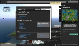
Recent version of the SL "Viewer" UI (danielvoyager.wordpress.com)

Recent version of the SL "Viewer" UI (danielvoyager.wordpress.com)

future before it happens. In SL, you inhabit a world that’s essentially made of information. Even the physical objects are, in essence, information — code that only pretends to be corporeal, but that can transform itself, disappear, reappear, whatever — a reality that can be changed as quickly as editing a sentence in a word processor.

While it’s true that our physical world can’t literally be changed that way, the truth is that the information layer that pervades it is becoming more substantial, more meaningful, and more influential in our experience of the world around us.

If “reality” is taken to be the sum total of all the informational and sensory experience we have of our environs, and we acknowledge that the informational (and to some degree sensory, as far as sight and sound go) layer is becoming dominated by digitally mediated, networked experience, then we are living in a place that is not too far off from what Second Life presents us.

Back when I was on some panels about Second Life, I would explain that the most significant aspect of the platform for user experience wasn’t the 3D space we were interacting with, but the “Viewer” — the mediating interface we used for navigating and manipulating that space. Linden Labs continually revised and matured the extensive menu-driven interface and search features to help inhabitants navigate that world, find other players & interest groups, or to create layers of permissions rules for all the various properties and objects. It was flawed, frustrating, volatile — but it was tackling some really fascinating, complex problems around how to live in a fluid, information-saturated world where wayfinding had more to do with the information layer *about* the actual places than the “physical” places themselves.

If we admit that the meaning & significance of our  physical world is becoming largely driven by networked, digital information, we can’t ignore the fact that Second Life was pioneering the tools we increasingly need for navigating, searching, filtering & finding our way through our “real life” environments.

What a city “means” to us is tied up as much in the information dimension that pervades it — the labels & opinions, statistics & rankings — the stuff that represents it on the grid, as it is the physical atoms we touch as we walk its sidewalks or drive through its streets, or as we sit in its restaurants and theaters. All those experiences are shaped powerfully by reviews and tips of Yelp, or the record of a friend having been in a particular spot as recorded in Foursquare, or a picture we see on Flickr taken at a particular latitude and longitude. Or the real-time information about where our friends are *right now* and which places are kinda dead tonight. Not to mention the market-generated information about price, quantity & availability.

It’s always been the case that the narrative of a place has as much to do with how we experience the reality of the place as the physical sensations we have of it in person. But now that narrative has been made explicit, as a matter of record, and cumulative as well — from the interactions of everyone who has gone before us there and left some shadow of their presence, thoughts, reactions.

One day it would be interesting to compare all the ways in which various bits of software are helping us navigate this information dimension to the tools invented for inhabiting and comprehending the pure-information simulacra of Second Life. I bet we’d find a lot of similarities.


I posted the content below over on the Macquarium Blog, but I’m repeating here for posterity, and to first add a couple other thoughts:

1. It’s amazing how easily corporations can fool themselves into feeling good about the experiences they create for their users by making elaborate dreamscapes & public theater — as if the fictions they’re creating somehow make up for the reality of what they deliver (and the hard work it takes to make reality square in any way with that imagined experience). This reminds me a bit of the excellent, well-executed dismemberment of this sort of thinking that Bret Victor posted this past week on the silliness & laziness behind things like the Microsoft “everything is a finger-tap slab” future-porn. Go read it.

2. Viral videos like the CocaCola Happiness Machine don’t only fool the originating brand into feeling overconfident — they make the audience seeing the videos mistake the bit of feel-good emotion they receive as substantial experience, and then wonder “how can my own company give such delight?” I’ve seen so many hours burned with brainstorming sessions where people are trying to come up with the answer to that — and they end up with more reality-numbing theatrics rather than fixing difficult problems with their actual product or service delivery.

Post after the cut — but it looks nicer on the MQ Blog ;-)
Read the rest of this entry »

In Defense of D

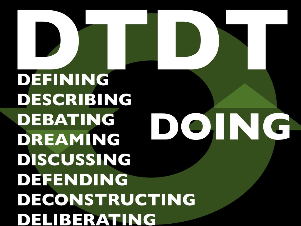
DTDT means lots of things

A long time ago, in certain communities of practice in the “user experience” family of practices, an acronym was coined: “DTDT” aka “Defining the Damned Thing”.

For good or ill, it’s been used for years now like a flag on the play in a football game. A discussion gets underway, whether heated or not, and suddenly someone says “hey can we stop defining the damned thing? I have work to do here, and you’re cluttering my [inbox / Twitter feed / ear drums / whatever …]”

Sometimes it rightly has reset a conversation that has gone well off the rails, and that’s fine. But more often, I’ve seen it used to shut down conversations that are actually very healthy, thriving and … necessary.

Why necessary? Because conversation *about* the practice is a healthy, necessary part of being a practitioner, and being in a community of other practitioners. It’s part of maturing a practice into a discipline, and getting beyond merely doing work, and on to being self-aware about how and why you do it.

It used to be that people weren’t supposed to talk about sex either. That tended to result in lots of unhappy, closeted people in unfulfilling relationships and unfulfilled desires. Eventually we learned that talking about sex made sex better. Any healthy 21st century couple needs to have these conversations — what’s sex for? how do you see sex and how is that different from how I see it? Stuff like that. Why do people tend to avoid it? Because it makes them uncomfortable … but discomfort is no reason to shun a healthy conversation.

The same goes for design or any other practice; more often than not, what people in these conversations are trying to do is develop a shared understanding of their practice, developing their professional identities, and challenging each other to see different points of view — some of which may seem mutually exclusive, but turn out to be mutually beneficial, or even interdependent.

I’ll grant that these discussions often have more noise than signal, but that’s the price you pay to get the signal. I’ll also grant that actually “defining” a practice is largely a red herring — a thriving practice continues to evolve and discover new things about itself. Even if a conversation starts out about clean, clinical definition, it doesn’t take long before lots of other more useful (but muddier, messier) stuff is getting sorted out.

It’s ironic to me that so many people in the “UX family” of practitioner communities utterly lionize “Great Figures” of design who are largely known for what they *wrote* and *said* about design as much as for the things they made, and then turn to their peers and demand they stop talking about what their practice means, and just post more pat advice, templates or tutorials.

A while back I was doing a presentation on what neuroscience is teaching us about being designers — how our heads work when we’re making design decisions, trying to be creative, and the rest. And one of the things I learned was the importance of metacognition — the ability to think about thinking. I know people who refuse to do such a thing — they just want to jump in and ACT. But more often than not, they don’t grow, they don’t learn. They just keep doing what they’re used to, usually to the detriment of themselves and the people around them. Do you want to be one of those people? Probably not.

So, enough already. It’s time we defend the D. Next time you hear someone pipe up and say “hey [eyeroll] can we stop the DTDT already?” kindly remind them that mature communities of practice discuss, dream, debate, deliberate, deconstruct and the rest … because ultimately it helps us get better, deeper and stronger at the Doing.

« Older entries § Newer entries »